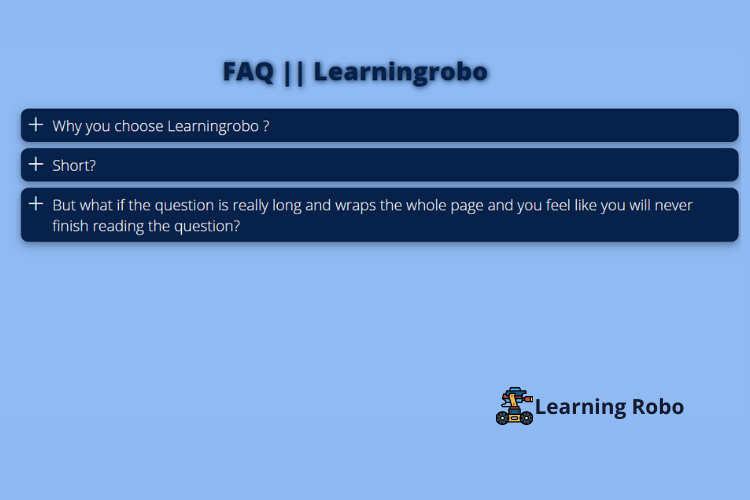
Hello developers, today in this blog you'll learn how to create a Responsive Accordion Menu using HTML & CSS.
An Accordion Menu may be a vertically stacked list of headers that will be clicked to reveal or hide content related to them. Accordion takes a little area that displays only inquiries to the user, if the user wants to read the solution then they have to open it by clicking or doing a hover on the question.
Here we used
three headers of an accordion and the contents which are associated with them
are hidden. When you click on each tab, the content of that header will be
revealed accordingly. Radio buttons have been used to control the accordion
button. Icons are used, which indicates to the user that the content is currently
hidden or expanded.
The source code of this Responsive Accordion Menu is given below, if you want the source code of this program, you can copy it. You can use this Responsive Accordion Menu code on your projects.
Responsive Accordion Menu [Source
Code]
To create this website, make two files: an HTML file & a CSS file. First, create an HTML file with the name of index.html and remember, you've to form a file with a .html extension.
CSS provides
style to an HTML page. To make the page attractive and page responsive create a
CSS file with the name style.css and remember that you've got need to make a
file with a .css extension.
@import url(https://fonts.googleapis.com/css?family=Open+Sans:300,800);

body {
  font-family: 'Open Sans';
  font-size: 1.5em;
  background:#8fbaf3;

}

.content {
  width: 80%;
  padding: 20px;
  margin: 0 auto;
  padding: 0 60px 0 0;
}

.centerplease {
  margin: 0 auto;
  max-width: 500px;
  font-size: 40px;
  font-weight: 600;
  text-shadow: 1px 1px 8px #06224a;
  color:#06224a;
}

.question {
  position: relative;
  background: #06224a;
  border-radius: 12px;
  margin: 0;
  padding: 10px 10px 10px 50px;
  display: block;
  width:100%;
  cursor: pointer;
  color:#ffffff;
  box-shadow: 0 4px 8px 0 rgba(0, 0, 0, 0.2), 0 6px 20px 0 rgba(0, 0, 0, 0.19);
}

.answers {
  background: #ffffff;
  color:#06224a;
  padding: 0px 15px;
  margin: 5px 0;
  height: 0;
  width:100%;
  overflow: hidden;
  z-index: -1;
  position: relative;
  opacity: 0;
  -webkit-transition: .7s ease;
  -moz-transition: .7s ease;
  -o-transition: .7s ease;
  transition: .7s ease;
  border-radius: 12px;
  box-shadow: 0 4px 8px 0 rgba(0, 0, 0, 0.2), 0 6px 20px 0 rgba(0, 0, 0, 0.19);
}

.questions:checked ~ .answers{
  height: auto;
  opacity: 1;
  padding: 15px;
}

.plus {
    color:#ffffff;
  position: absolute;
  margin-left: 10px;
  z-index: 5;
  font-size: 2em;
  line-height: 100%;
  -webkit-user-select: none;
  -moz-user-select: none;
  -ms-user-select: none;
  -o-user-select: none;
  user-select: none;
  -webkit-transition: .3s ease;
  -moz-transition: .3s ease;
  -o-transition: .3s ease;
  transition: .3s ease;
}

.questions:checked ~ .plus {
  -webkit-transform: rotate(45deg);
  -moz-transform: rotate(45deg);
  -o-transform: rotate(45deg);
  transform: rotate(45deg);
}

.questions {
  display: none;
}Thank you for reading our blog. If you face any problem in creating this Responsive Accordion Menu using HTML & CSS, then contact us or comment us. We’ll try to provide a solution to your problem as soon as possible.


Post a Comment
Thank you
Learning robo team