About us, the page says a lot about who you are and about your company. The design of the website’s about us page is a visual reflection of the company. It’s an opportunity to increase the interest of site visitors.
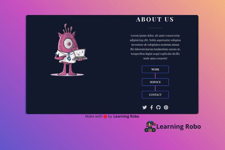
On this website (Responsive About Us Page), there is a photo or icon of the company at the left of the page with some information about the company on the right side of the page, above this, there can be the name of the company. Below the description, there is a flow chart button which is named work, service, contact and also there are some social media icons. When you move the mouse over the button, the border color of the button changes, and on hovering social media icons, the color of the icon changes.
This Responsive About Us Page is made responsive by using CSS media query property. On PC, the photo or icon and the other details are aligned horizontally. But on the smaller screen, they are aligned vertically or one by one.
The source code of this Responsive About Us Page using HTML & CSS is given below, if you want the source code of this program, you can copy it. You can use this Responsive About Us Page code on your projects.
Responsive About Us Page [Source Code]
To make this website, you would like to make two files: an HTML file & a CSS file. First, create an HTML file with the name of index.html and remember, you've to make a file with a .html extension.
@import url('https://fonts.googleapis.com/css2?family=Playfair+Display:wght@400;500;600;700&display=swap');

*{
    box-sizing: border-box;
    padding: 0;
    margin: 0;
}
body{
    font-family: 'Playfair Display', serif;
    display: grid;
    background-color: #4158D0;
background-image: linear-gradient(43deg, #4158D0 0%, #C850C0 46%, #FFCC70 100%);

    align-content: center;
    min-height: 100vh;
}
section{
    display: grid;
    grid-template-columns: 1fr 1fr;
    min-height: 70vh;
    width: 75vw;
    margin: 0 auto;
    box-shadow: 0 4px 8px 0 rgba(0, 0, 0, 0.2), 0 6px 20px 0 rgba(0, 0, 0, 0.19);
    border-radius: 12px
}
.image{
    background-color: #12192c;
    display: flex;
    border-radius: 12px 0 0 12px;
}
.image img{
height:50vh;
margin:50px auto
}
.content{
    background-color: #12192c;
    display: flex;
    justify-content: center;
    flex-direction: column;
    align-items: center;
    border-radius: 0  12px 12px 0;
    color: #fff;
}
.content h2{
    text-transform: uppercase;
    font-size: 36px;
    letter-spacing: 6px;
    opacity: 0.9;
}
.content span{
    height: 0.5px;
    width: 80px;
    background: #777;
    margin: 30px 0;
}
.content p{
    padding-bottom: 15px;
    font-weight: 300;
    opacity: 0.7;
    width: 60%;
    text-align: center;
    margin: 0 auto;
    line-height: 1.7;
    color:#ffffff
}
.links{
    margin: 15px 0;
}
.links li{
    border: 2px solid #4158D0;
    list-style: none;
    border-radius: 5px;
    padding: 10px 15px;
    width: 160px;
    text-align: center;
}
.links li a{
    text-transform: uppercase;
    color: #fff;
    text-decoration: none;
}
.links li:hover{
    border-color: #C850C0;
}

.vertical-line{
    height: 30px;
    width: 3px;
    background: #C850C0;
    margin: 0 auto;
}
.icons{
    display: flex;
    padding: 15px 0;
}
.icons li{
    display: block;
    padding: 5px;
    margin: 5px;
}
.icons li i{
    font-size: 26px;
    opacity: 0.8;
}
.icons li i:hover{
    color: #C850C0;
    cursor: pointer;
}


/*****************/

@media(max-width: 900px){
    section{
        grid-template-columns: 1fr;
        width: 100%;
        border-radius: none;
    }
    .image{
        height: 100vh;
        border-radius: none;
    }
    .content{
        height: 100vh;
        border-radius: none;
    }
    .content h2{
        font-size: 20px;
        margin-top: 50px;
    }
    .content span{
        margin: 20px 0;
    }
    .content p{
        font-size: 14px;
    }
    .links li a{
        font-size: 14px;
    }
    .links{
        margin: 5px 0;
    }
    .links li{
        padding: 6px 10px;
    }
    .icons li i{
        font-size: 15px;
    }
}
.credit{
    text-align: center;
    color: #000;
    font-family: 'Trebuchet MS', 'Lucida Sans Unicode', 'Lucida Grande', 'Lucida Sans', Arial, sans-serif;
  }

  .credit a{
    text-decoration: none;
    color:#000;
    font-weight: bold;
  }
Thank you for reading our blog. If you face any problem in creating this Responsive About Us Page using HTML & CSS, then contact us or comment us. We’ll try to provide a solution to your problem as soon as possible.


Post a Comment
Thank you
Learning robo team