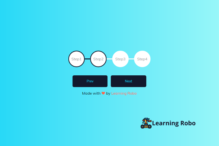
The step progress bars are used to visualize the quantity of the work that has been completed. The step progress bar is used to display the progress of the work in a step format. It shows how much work has been completed and how many steps are there to complete the work yet.
In this blog (Step Progress bar), there is four step progress bar at the center of the webpage. There are two buttons below the step progress bar which are named as prev and next. When you click the next button it will redirect you to the next step and when you click on the previous (prev) button it will redirect you to the previous step. This step progress bar can be used in the multi-step form.
The source code of this Step progress bar is given below, if you want the source code of this program, you can copy it. You can use this Step progress bar code with your creativity and can take this project to the next level.
Step progress bar [Source Code]
To make this website (Step progress bar), you need to create three files: an HTML file, a CSS file, and JavaScript. First, create an HTML file with the name of index.html and remember, you have to create a file with a .html extension.
@import url('https://fonts.googleapis.com/css?family=Muli&display=swap');

:root {
  --line-border-fill: #12192c;
  --line-border-empty: #fff;
}

* {
  box-sizing: border-box;
}

body {
    background: #B2FEFA;
    background: -webkit-linear-gradient(to right, #0ED2F7, #B2FEFA);
    background: linear-gradient(to right, #0ED2F7, #B2FEFA);

  font-family: 'Muli', sans-serif;
  display: flex;
  align-items: center;
  justify-content: center;
  height: 100vh;
  overflow: hidden;
  margin: 0;
}

.container {
  text-align: center;
}

.progress-container {
  display: flex;
  justify-content: space-between;
  position: relative;
  margin-bottom: 30px;
  max-width: 100%;
  width: 350px;
}

.progress-container::before {
  content: '';
  background-color: var(--line-border-empty);
  position: absolute;
  top: 50%;
  left: 0;
  transform: translateY(-50%);
  height: 4px;
  width: 100%;
  z-index: -1;
}

.progress {
  background-color: var(--line-border-fill);
  position: absolute;
  top: 50%;
  left: 0;
  transform: translateY(-50%);
  height: 4px;
  width: 0%;
  z-index: -1;
  transition: 0.4s ease;
}

.circle {
  background-color: #fff;
  color: #999;
  border-radius: 50%;
  height: 70px;
  width: 70px;
  display: flex;
  align-items: center;
  justify-content: center;
  border: 3px solid var(--line-border-empty);
  transition: 0.4s ease;
}

.circle.active {
  border-color: var(--line-border-fill);
}

.btn {
  background-color: var(--line-border-fill);
  color: #0ED2F7;
  border: 0;
  border-radius: 6px;
  cursor: pointer;
  font-family: inherit;
  padding: 16px 60px;
  margin: 5px;
  font-size: 14px;
}

.btn:active {
  transform: scale(0.98);
}

.btn:focus {
  outline: 0;
}

.btn:disabled {
  background-color: var(--line-border-empty);
  cursor: not-allowed;
}
.credit a{
    text-decoration: none;
    color: tomato;
  }

  .credit {
      margin-top: 10px;
      text-align: center;
  }
const progress = document.getElementById('progress')
const prev = document.getElementById('prev')
const next = document.getElementById('next')
const circles = document.querySelectorAll('.circle')

let currentActive = 1

next.addEventListener('click', () => {
    currentActive++

    if(currentActive > circles.length) {
        currentActive = circles.length
    }

    update()
})

prev.addEventListener('click', () => {
    currentActive--

    if(currentActive < 1) {
        currentActive = 1
    }

    update()
})

function update() {
    circles.forEach((circle, idx) => {
        if(idx < currentActive) {
            circle.classList.add('active')
        } else {
            circle.classList.remove('active')
        }
    })

    const actives = document.querySelectorAll('.active')

    progress.style.width = (actives.length - 1) / (circles.length - 1) * 100 + '%'

    if(currentActive === 1) {
        prev.disabled = true
    } else if(currentActive === circles.length) {
        next.disabled = true
    } else {
        prev.disabled = false
        next.disabled = false
    }
}
Thank you for reading our blog. If you face any problem in creating this Step progress bar using HTML, CSS & JavaScript, then contact us or comment us. We’ll try to provide a solution to your problem as soon as possible.


Post a Comment
Thank you
Learning robo team