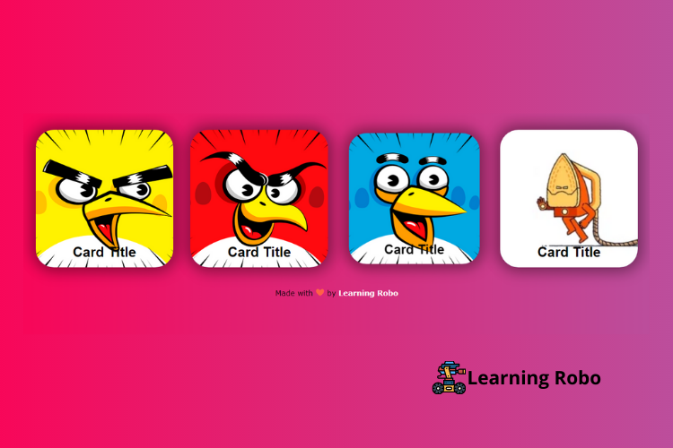
Hello developers, today in this blog you'll learn how to create a Responsive Play Title Card Design using HTML & CSS.
The card design can be a convenient means of displaying contents that include various information pictures or icons of the particular information that what has to be displayed or conveyed, title and description.
In this blog (Responsive Play Title Card Design) on the webpage, there are four cards, the cards have some game pictures with the title of the game at the bottom of the card. We have done this card to create a play card design with its title, where you can create many cards as many cards as you need with the respective picture and title. This Play Title Card Design is made responsive. When you view this page on a larger screen, the cards are arranged horizontally, whereas on the smaller screen the cards are arranged vertically that is one by one.
The source code of this Responsive Play Title Card Design is given below, and you can copy the source code of this program. You can use this code of Responsive Play Title Card Design with your creativity and can take this card to the subsequent level.
Responsive Play Title Card Design [Source Code]
To make this website (Responsive Play Title Card Design), you need to create two files: an HTML file & a CSS file. First, create an HTML file with the name of index.html and remember, you have to create a file with a .html extension.
.cards-list {
  z-index: 0;
  width: 100%;
  display: flex;
  justify-content: space-around;
  flex-wrap: wrap;
}

.card {
  margin: 30px auto;
  width: 300px;
  height: 300px;
  border-radius: 40px;
box-shadow: 5px 5px 30px 7px rgba(0,0,0,0.25), -5px -5px 30px 7px rgba(0,0,0,0.22);
  cursor: pointer;
  transition: 0.4s;
}

.card .card_image {
  width: inherit;
  height: inherit;
  border-radius: 40px;
}

.card .card_image img {
  width: inherit;
  height: inherit;
  border-radius: 40px;
  object-fit: cover;
}

.card .card_title {
  text-align: center;
  border-radius: 0px 0px 40px 40px;
  font-family: sans-serif;
  font-weight: bold;
  font-size: 30px;
  margin-top: -80px;
  height: 40px;
}

.card:hover {
  transform: scale(0.9, 0.9);
  box-shadow: 5px 5px 30px 15px rgba(0,0,0,0.25),
    -5px -5px 30px 15px rgba(0,0,0,0.22);
}

.title-white {
  color: Black;
}

.title-black {
  color: black;
}

@media all and (max-width: 500px) {
  .card-list {
    flex-direction: column;
  }
}


.card {
  margin: 30px auto;
  width: 300px;
  height: 300px;
  border-radius: 40px;
  background-image: url('https://i.redd.it/b3esnz5ra34y.jpg');
  background-size: cover;
  background-repeat: no-repeat;
  background-position: center;
  background-repeat: no-repeat;
box-shadow: 5px 5px 30px 7px rgba(0,0,0,0.25), -5px -5px 30px 7px rgba(0,0,0,0.22);
  transition: 0.4s;
}
body{
  background: #bc4e9c;
background: -webkit-linear-gradient(to right, #f80759, #bc4e9c);
background: linear-gradient(to right, #f80759, #bc4e9c);

}

.credit a{
  text-decoration: none;
  color: #fff;
  font-weight: 800;
  }

  .credit {
    font-family: Verdana, Geneva, Tahoma, sans-serif;
    margin: 10px;
    color:#000;
    text-align: center;
  }
Thank you for reading our blog. If you face any problem in creating this Responsive Play Title Card Design using HTML & CSS, then contact us or comment us. We’ll try to provide a solution to your problem as soon as possible.


Post a Comment
Thank you
Learning robo team