

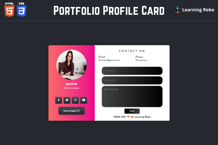
How to create a Stunning Portfolio Profile Card with Contact Form using HTML and CSS.[Source Code]
To make this website, you would like to make two files: an HTML file, a CSS file. First, create an HTML file with the name of index.html and remember, you have to create a file with a .html extension.
@import url('https://fonts.googleapis.com/css?family=Josefin+Sans&display=swap');

*{
  margin: 0;
  padding: 0;
  box-sizing: border-box;
  list-style: none;
  font-family: 'Josefin Sans', sans-serif;
}

body{
  background-color: #25292e;
   font-family: sans-serif;

}

.wrapper{
  position: absolute;
  top: 50%;
  left: 50%;
  transform: translate(-50%,-50%);
  width: 800px;
  height:500px;
  display: flex;
  box-shadow: -10px 5px 20px rgba(0, 0, 0, 0.1);
}

.wrapper .left{
  width: 40%;
  background: #ec008c;
background: -webkit-linear-gradient(to right, #fc6767, #ec008c);
background: linear-gradient(to right, #fc6767, #ec008c);
  padding: 30px 25px;
  border-top-left-radius: 10px;
  border-bottom-left-radius: 5px;
  text-align: center;
  color: #fff;
  box-shadow: 8px 0px 38px -20px rgba(0,0,0,1);
}

.wrapper .left img{
  border-radius: 50%;
  margin-bottom: 10px;
  width:200px;
  height:200px;
}

.wrapper .left h4{
  margin-bottom: 10px;
  font-size: 20px;
  font-family: sans-serif;

}

.wrapper .left p{
  font-size: 15px;

}

.wrapper .right{
  width: 65%;
  background: #fff;
  padding: 30px 25px;
  border-top-right-radius: 5px;
  border-bottom-right-radius: 5px;
}

.info,
.projects{
  margin-bottom: 25px;
}

.info h3,
.projects h3{
    margin-bottom: 15px;
    padding-bottom: 5px;
    border-bottom: 1px solid #e0e0e0;
    color: #353c4e;
    text-align: center;
  text-transform: uppercase;
  letter-spacing: 5px;
}

.info_data,
.projects_data{
  display: flex;
  justify-content: space-between;
}

.info_data .data,
.projects_data .data{
  width: 45%;
}

.info_data .data h4,
.projects_data .data h4{
    color: #353c4e;
    font-size: 17px;
    margin-bottom: 5px;
}

.info_data .data p,
.projects_data .data p{
  font-size: 15px;
  margin-bottom: 10px;
  color: #4a4f54;
}

.social_media ul{
  display: flex;
  margin-top: 50px;
  margin-left: 20px;
}

.social_media ul li{
  width: 45px;
  height: 45px;
  background-image: linear-gradient(#464d55, #25292e);
  margin-right: 10px;
  border-radius: 5px;
  text-align: center;
  line-height: 45px;
}

.social_media ul li a{
  color :#fff;
  display: block;
  font-size: 18px;
}

.right form {
  margin-top: 20px;
  display: flex;
  flex-direction: column;
  align-items: center;
}
.right form input[type="text"], .back form textarea {
  padding: 20px;
  margin-bottom: 10px;
  border-radius: 20px;
  border: none;
  box-shadow: 0 2px 4px 0 rgba(0, 0, 0, 0.2);
  width: 90%;
  background: linear-gradient(to right, #434343, #000000);
  color:#ffffff;
}
.right form input[type="submit"] {
  background: linear-gradient(to left, #434343, #000000);
  color: white;
  border: none;
  padding: 10px;
  border-radius: 5px;
  box-shadow: 0 2px 4px 0 rgba(0, 0, 0, 0.2);
  width: 100px;
  cursor: pointer;
  margin-top: 10px;
}
textarea {
  font-size: 16px;
  line-height: 1.5;
  padding: 10px;
  border:none;
  border-radius: 20px;
  width: 90%;
  color: white;
  box-shadow: 0 2px 4px 0 rgba(0, 0, 0, 0.2);
  background: linear-gradient(to right, #434343, #000000);
}
.right form input[type="submit"]:hover {
  background: linear-gradient(to right, #434343, #000000);
}
/* CSS */
.button-84 {
  align-items: center;
  background-color: initial;
  background-image: linear-gradient(#464d55, #25292e);
  border-radius: 8px;
  border-width: 0;
  box-shadow: 0 10px 20px rgba(0, 0, 0, .1),0 3px 6px rgba(0, 0, 0, .05);
  box-sizing: border-box;
  color: #fff;
  cursor: pointer;
  font-family: expo-brand-demi,system-ui,-apple-system,BlinkMacSystemFont,"Segoe UI",Roboto,"Helvetica Neue",Arial,"Noto Sans",sans-serif,"Apple Color Emoji","Segoe UI Emoji","Segoe UI Symbol","Noto Color Emoji";
  font-size: 18px;
  height: 52px;
  margin: 20px 0 0 0;
  outline: none;
  padding: 0 32px;
  text-align: center;
  text-decoration: none;
  transform: translate3d(0, 0, 0);
  transition: all 150ms;
}

.button-84:hover {
  box-shadow: rgba(0, 1, 0, .2) 0 2px 8px;
  opacity: .85;
}

.button-84:active {
  outline: 0;
}

.button-84:focus {
  box-shadow: rgba(0, 0, 0, .5) 0 0 0 3px;
}

@media (max-width: 420px) {
  .button-84 {
    height: 48px;
  }
}

.credit a {
  text-decoration: none;
  color: #000;
  font-weight: 800;
}

.credit {
    color: #000;
  text-align: center;
  margin-top: 10px;
  font-family: Verdana,Geneva,Tahoma,sans-serif;
}
Thank you for reading our blog. If you face any problem in Creating a Stunning Portfolio Profile Card with Contact Form using HTML and CSS., then contact us or comment to us. We’ll try to provide a solution to your problem as soon as possible.
Explore
Press The Key ' p ' and say ' read article ' our voice assistant read our article.
In Our older post it doesnot work we working on that.
In Our older post it doesnot work we working on that.
Post a Comment
Thank you
Learning robo team