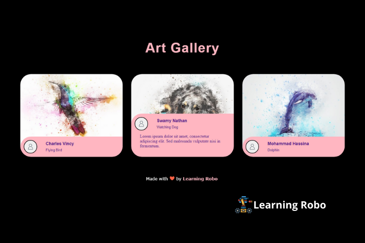
Hello developers, today in this blog, you'll learn how to create a Card Design with Hover Animation using HTML & CSS.
A card design is a UI design pattern that groups related information in a flexible-size container visually resembling a playing card. A card contains information about something or someone. A card consists of images and text.
In this program (Card Design with Hover Animation) on the webpage, three cards contain an image. There is an information part below the images respectively. If you hover over the image, the information container slides up and shows up the complete information part that overlays over half of the mage. CSS animation is used for the sliding up of the content. CSS border-radius property has been used for the information container. The information content of the card contains the profile picture of the person, their name, picture name, and the description of the content.
The source code of this Card Design with Hover Animation using HTML & CSS is given below, if you want the source code of this program, you can copy it. You can use this code of Card Design with Hover Animation with your creativity and can take this table to the next level.
Card Design with Hover Animation using HTML & CSS [Source Code]
To make this website, you would like to make two files: an HTML file & a CSS file. First, create an HTML file with the name of index.html and remember, you have to create a file with a .html extension.
:root {
  --curve: 40;
}

* {
  box-sizing: border-box;
}

body {
  font-family: 'PT Sans Narrow', sans-serif;
  background-color: #000;
}
h1{
	text-align: center;
	color: #FFB6C1;
	font-size: 50px;
	letter-spacing: 2px;
	padding: 5px;
}
.cards {
  display: grid;
  justify-content: center;
  grid-template-columns: repeat(auto-fit, minmax(300px, 1fr));
  gap: 2rem;
  margin: 4rem 5vw;
  padding: 0;
  list-style-type: none;
}

.card {
  position: relative;
  display: block;
  height: 110%;
  border-radius: calc(var(--curve) * 1px);
  overflow: hidden;
  text-decoration: none;
}

.card__image {
  width: 100%;
  height: auto;
}

.card__overlay {
  position: absolute;
  bottom: 0;
  left: 0;
  right: 0;
  z-index: 1;
  border-radius: calc(var(--curve) * 1px);
  background-color: var(--surface-color);
  transform: translateY(100%);
  transition: .2s ease-in-out;
}

.card:hover .card__overlay {
  transform: translateY(0);
}

.card__header {
  position: relative;
  display: flex;
  align-items: center;
  gap: 2em;
  padding: .8em;
  border-radius: calc(var(--curve) * 1px) 0 0 0;
  background-color: #FFB6C1;
  transform: translateY(-100%);
  transition: .2s ease-in-out;
}
.card:hover .card__header {
  transform: translateY(0);
}

.card__thumb {
  flex-shrink: 0;
  width: 50px;
  height: 50px;
  border-radius: 50%;
  border: 2px solid #000;
}

.card__title {
  font-size: 1em;
  margin: 0 0 .3em;
}

.card__tagline {
  display: block;
  margin: 1em 0;
  font-family: "MockFlowFont";
  font-size: .8em;
}

.card__status {
  font-size: .8em;
}

.card__description {
  padding: 0 2em 2em;
  margin: 0;
  font-family: "MockFlowFont";
  display: -webkit-box;
  -webkit-box-orient: vertical;
  -webkit-line-clamp: 3;
  overflow: hidden;
  background-color: #FFB6C1;
}
.credit a{
  text-decoration: none;
  color: #FFB6C1;
  font-weight: 800;
}
.credit {
  position: fixed;
  color: #fff;
  left:40%;
  margin-top: 30px;
  font-family: Verdana, Geneva, Tahoma, sans-serif;
}
Thank you for reading our blog. If you face any problem in creating this Card Design with Hover Animation using HTML & CSS then contact us or comment us. We’ll try to provide a solution to your problem as soon as possible.


Post a Comment
Thank you
Learning robo team