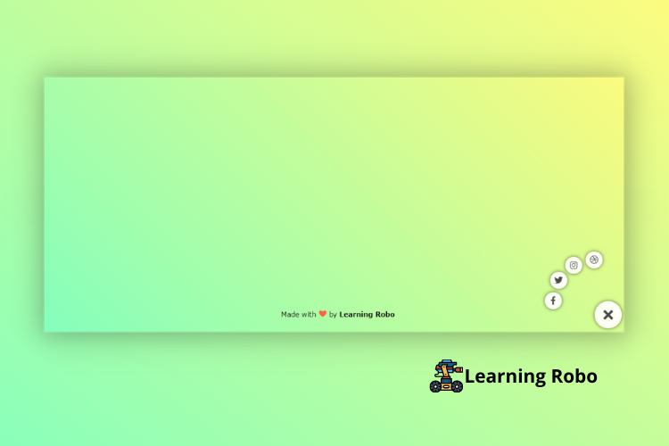
Hello developers, today in this blog, you'll learn how to create Floating Social Media Buttons using HTML, CSS & JavaScript.
A floating action menu is typically a circular button that sticks to the right bottom of the webpage and pops up a floating interface containing menu links, social buttons, or commonly used actions when clicked or tapped.
In this program (Floating Social Media Buttons) on the webpage, there is a cross or close button at the right bottom of the webpage, and some social media icons around the close button. When you hover on the social media button and cross or close button, the border is created around the buttons. When you click on the cross or close button, all the social media buttons will go inside the cross button and in the place of the cross or close button, the plus (+) button will appear. When you click on the plus (+) button, all the social media will get arranged around the cross or close button.
The source code of this Floating Social Media Buttons is given below, if you want the source code of this program, you can copy it. You can use these Floating Social Media Buttons code on your projects.
Floating Social Media Buttons [Source Code]
To make this website, you would like to make three files: an HTML file, a CSS file & a JavaScript file. First, create an HTML file with the name of index.html and remember, you have to create a file with a .html extension.
<!DOCTYPE html>
<html lang="en" >
<head>
<meta charset="UTF-8">
<title>Floating Action Button || learningrobo</title>
<link rel='stylesheet' href='https://cdnjs.cloudflare.com/ajax/libs/font-awesome/5.15.3/css/all.min.css'><link rel="stylesheet" href="style.css">
</head>
<body>
<menu class="open">
<a href="#" class="action"><i class="fab fa-dribbble"></i></a>
<a href="#" class="action"><i class="fab fa-instagram"></i></a>
<a href="#" class="action"><i class="fab fa-twitter"></i></a>
<a href="#" class="action"><i class="fab fa-facebook-f"></i></a>
<a href="#" class="trigger"><i class="fas fa-plus"></i></a>
</menu>
<div class="credit">Made with <span style="color:tomato;font-size:20px;">❤</span> by <a href="https://www.learningrobo.com/">Learning Robo</a></div>
<script src="script.js"></script>
</body>
</html>
CSS provides style to an HTML page. To make the page attractive create a CSS file with the name style.css and remember that you have to make a file with a .css extension.
Thank you for reading our blog. If you face any problem in creating these Floating Social Media Buttons using HTML, CSS & JavaScript, then contact us or comment us. We’ll try to provide a solution to your problem as soon as possible.
A floating action menu is typically a circular button that sticks to the right bottom of the webpage and pops up a floating interface containing menu links, social buttons, or commonly used actions when clicked or tapped.
In this program (Floating Social Media Buttons) on the webpage, there is a cross or close button at the right bottom of the webpage, and some social media icons around the close button. When you hover on the social media button and cross or close button, the border is created around the buttons. When you click on the cross or close button, all the social media buttons will go inside the cross button and in the place of the cross or close button, the plus (+) button will appear. When you click on the plus (+) button, all the social media will get arranged around the cross or close button.
The source code of this Floating Social Media Buttons is given below, if you want the source code of this program, you can copy it. You can use these Floating Social Media Buttons code on your projects.
Floating Social Media Buttons [Source Code]
To make this website, you would like to make three files: an HTML file, a CSS file & a JavaScript file. First, create an HTML file with the name of index.html and remember, you have to create a file with a .html extension.
body {
  min-height: 100vh;

  background-color: #85FFBD;
  background-image: linear-gradient(45deg, #85FFBD 0%, #FFFB7D 100%);

}

* {
  padding: 0;
  margin: 0;
}


menu {
  --size: 2.1rem;
  --radius: 6rem;
  --padding: .5rem;
  --bg-color: rgba(255, 255, 255, 0.9);
  --fg-color: rgba(0, 0, 0, 0.7);
  --hi-color: #12192c;
  font-size: 29px;
  position: fixed;
  bottom: var(--padding);
  right: var(--padding);
}

menu > * {
  position: absolute;

  display: grid;
  place-content: center;

  border-radius: 50%;
  font-size: 29px;
  background: var(--bg-color);
  color: var(--fg-color);

  text-decoration: none;

  box-shadow: 0px 0px 9px 0px rgba(0, 0, 0, 0.6);
}

menu > .action {
  --factor: 0;
  width: 2.5rem;
  height: 2.5rem;
  right: calc(1.35 * var(--size));
  bottom: calc(1.35 * var(--size));

  opacity: 0;

  transform: rotate(calc(-1 * var(--angle))) translateY(calc(-1 * var(--radius) * var(--factor))) rotate(var(--angle));

  transition: transform 250ms ease-in-out, opacity 250ms ease-in-out, box-shadow 250ms ease-in-out, color 250ms ease-in-out;
}

menu > .action:hover, menu > .trigger:hover {
  color: var(--hi-color);
  box-shadow: 0px 0px 0px 0.35rem rgba(0, 0, 0, 0.2);
}

menu.open > .action {
  --factor: 1;
  font-size: 20px;
  opacity: 1;
}

menu > .action:nth-child(1) {
  --angle: 0deg;
  transition-delay: 0ms;
}

menu > .action:nth-child(2) {
  --angle: 30deg;
  transition-delay: 50ms;
}

menu > .action:nth-child(3) {
  --angle: 60deg;
  transition-delay: 100ms;
}

menu > .action:nth-child(4) {
  --angle: 90deg;
  transition-delay: 150ms;
}

menu > .trigger {
  width: calc(1.9 * var(--size));
  height: calc(1.9 * var(--size));
  bottom: 0;
  right: 0;

  font-size: 2rem;
  transition: box-shadow 250ms ease-in-out, color 250ms ease-in-out;
}

menu > .trigger > i {
  transition: transform 250ms ease-in-out;
}

menu.open > .trigger > i {
  transform: rotate(-135deg);
}

.credit a{
  text-decoration: none;
  color: #000;
  font-weight: 800;
  }

  .credit {
      text-align: center;
    font-family: Verdana, Geneva, Tahoma, sans-serif;
    margin: 10px;
    position: fixed;
    bottom :20px;
    left:40%
  }
const trigger = document.querySelector("menu > .trigger");
trigger.addEventListener('click', (e) => {
  e.currentTarget.parentElement.classList.toggle("open");
});
Thank you for reading our blog. If you face any problem in creating these Floating Social Media Buttons using HTML, CSS & JavaScript, then contact us or comment us. We’ll try to provide a solution to your problem as soon as possible.


Ho to make it closed by default?
ReplyDeletePost a Comment
Thank you
Learning robo team