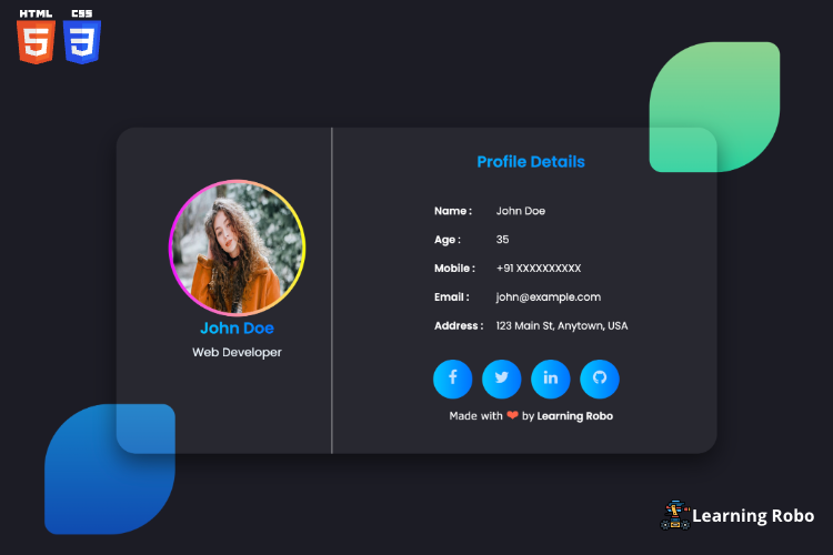
Hello developers, In today's world, web design has become more than just a means of conveying information. It has now become an art form where designers can express themselves and create stunning visuals that engage users. One popular design trend that has been making waves in recent years is glass morphism. Glass morphism is a design style that mimics the look of frosted glass and is characterized by its translucent effect, soft blur, and subtle shadows. In this article, we will be discussing how to create a glass morphism horizontal profile card with social icons and bio details using HTML and CSS.
Creating a Responsive Glass morphism horizontal profile card with social icons and bio details Using HTML CSS.[Source Code]
To make this website, you would like to make three files: an HTML file, a CSS file. First, create an HTML file with the name of index.html and remember, you have to create a file with a .html extension.
@import url('https://fonts.googleapis.com/css2?family=Poppins:wght@200;300;400;500;600&display=swap');
*{
    margin: 0;
    padding: 0;
    font-family: 'Poppins', sans-serif;
}

body{
    background-color: #1c1c25;
    font-family: Arial, sans-serif;
    padding: 20px;
}

html, body {
    height: 100%;
  }
  section{
    height:100vh;
    width:100%;
    display: flex;
    flex-direction: column;
    justify-content: center;
    align-items: center;
  }
section::before,
.card1::before{
    content: '';
    position: absolute;
    width: 200px;
    height: 200px;
    border-radius: 50% 20px;
    opacity:.8;
}

section::before{
    top: 6%;
    left: 75%;
    background: linear-gradient(#AAFFA9, #11FFBD);
}

.card1::before{
    bottom:2%;
    left: 10%;
    background: linear-gradient(#0098f0, #0457d3);
}
.card {
    display: flex;
    flex-direction: row;
    justify-content: space-between;
    align-items: center;
    border-radius: 30px;
    padding: 10px;
    box-shadow: 0px 0px 5px rgba(0, 0, 0, 0.2);
    width: 900px;
    height: 480px;
    box-shadow: 0 15px 35px rgba(0,0,0,0.5);
    background-color: rgba(255,255,255,0.05);
    filter: blur(0.2px);
}
.left-container {
    flex: 1;
    max-width: 30%;
    display: flex;
    flex-direction: column;
    align-items: center;
    height:100%;
    padding: 10px;
    margin: 30px;
    border-right: 1px solid #e4e4e4;
  }

  .right-container {
    flex: 1;
    max-width:70%;
    height:430px;
    padding: 10px;
    margin: 20px;
    border-radius:30px;
  }
  @media only screen and (max-width: 860px) {
    .card
     {
     flex-direction: column;
     margin: 10px;
     height: auto;
     width: 100%;
    }
    .left-container{
        flex: 1;
        max-width:100%;
        border:none;
    }
 section::before{
        top:4%;
        left:51%;
    }
  }
  @media only screen and (max-width: 600px) {
    .card
     {
     flex-direction: column;
     margin: 10px;
    }
    .left-container{
        flex: 1;
        max-width:100%;
    }
    .card1::before{
        bottom: -14%;
        left: 1%;
    }


  }
  img {
    border: double 5px transparent;
    border-radius: 50%;
    background-image: linear-gradient(white, white),
                      linear-gradient(to right, #ee00ff,#fbff00);
    background-origin: border-box;
    background-clip: content-box, border-box;
    width: 200px;
    height: 200px;
    max-width: 200px;
    margin-top: 70px;
  }

  h2 {
    font-size: 24px;
    margin-bottom: 5px;
  }
  h3 {
    text-align: center;
    font-size: 24px;
    margin-bottom: 5px;
  }
  .gradienttext{
    background-image: linear-gradient(to right, #00c6ff 0%, #0072ff 100%);
    color: transparent;
    -webkit-background-clip: text;
  }
  .social-icons {
    display: flex;
    justify-content: center;
    align-items: center;
  }

  .social-icons a {
    background-image: linear-gradient(to right, #00c6ff 0%, #0072ff 100%);
    display: inline-block;
    margin-right: 15px;
    padding:15px ;
    width:30px;
    height:30px;
    border-radius:30px;
    text-align: center;
  }

  .social-icons i {
    font-size: 24px;
    color:rgba(255, 255, 255, .7);
    transition: all 0.3s ease;
  }

  .social-icons i:hover {
    color: rgba(255, 255, 255, 1);
  }
  p {
    font-size: 18px;
    margin-bottom: 20px;
    color:aliceblue
  }

  table {
    display: flex;
    flex-direction: column;
    justify-content: center;
    align-items: center;
    width: 100%;
    height: 280px;
    border-collapse: collapse;
  }

  td {

    padding: 10px;
    border: none;
    border-radius: 20px;
    color: white;
  }

  td:first-child {
    font-weight: bold;
  }
  .credit a {
  text-decoration: none;
  color: #fff;
  font-weight: 800;
}

.credit {
    color: #fff;
  text-align: center;
  margin-top: 10px;
  font-family: Verdana,Geneva,Tahoma,sans-serif;
}
Thank you for reading our blog. If you face any problem in creating this Responsive Glass morphism horizontal profile card with social icons and bio details Using HTML CSS., then contact us or comment to us. We’ll try to provide a solution to your problem as soon as possible.
code developed by our student SUBHASRI K
Explore
Click the Live edit to edit the template online with live preview and download it.🤩


إرسال تعليق
Thank you
Learning robo team